Blog sponsorship. It’s a touchy subject. But the truth of the matter is, if you have a blog that receives a fair amount of traffic, blogging turns into an expense – financially speaking.
When I first created House*Tweaking, I had a free Blogger account and I was working part-time as a pharmacist. Blogging was purely a hobby. Over the years, with an increase in readership {I’m still not entirely sure why you guys choose to follow House*Tweaking with so many amazing blogs out there but I’m truly grateful that you do. Thank you!}, I’ve obtained a URL and transferred House*Tweaking from Blogger to a “meh” web host and then to a private server. Oh, and I left my day job. Those things combined have made it necessary for me to look into sponsorship opportunities in the form of side bar ads, affiliate programs, writing elsewhere and collaborating with reputable companies. I am not looking to get rich. My hope is to cover the costs of maintaining this blog, DIYing projects and decorating our house so that I can continue doing what now has become a passion.
In working with companies, I always try to feature businesses and products that I would use myself. I say no to potential sponsors ten times more than I say yes. I really want it to be a win-win-win situation. The company gains some traffic. I cover my costs. You are introduced to an inspiring and useful product/service.
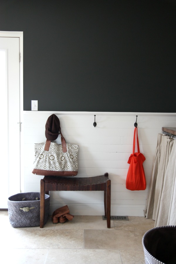
All that mumbo jumbo to say I’ve been brainstorming new ways to partner with businesses. When I signed on to write for Wayfair’s blog, My Way Home, I had an “a-ha!” moment. Why not feature items from their site that I would like to use in my own home? I had shopped Wayfair before {I bought the saddler’s bench shown above} and was really pleased with my purchase. I pitched the idea to Wayfair and the monthly “Wayfair in the House” series was born. This is the first of such posts! Here we go…
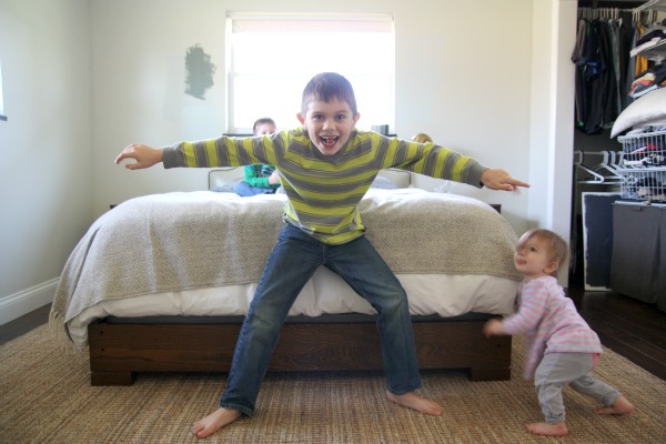
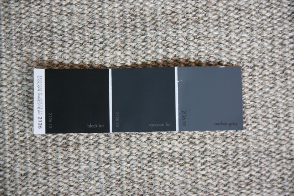
I’m so ready to have a cozy bedroom. I tried capturing a current pic of the room but was immediately photobombed by three rugrats. It’s hard to tell from the image above but there are random paint sample patches painted throughout the room. There’s even painted foam board living in our closet and paint swatches propped on the windowsill. Do you spy them? My nightstand drawer is full of color swatches and paint decks. It’s bad. I’ve tried no less than a dozen colors and don’t like any of them. This northeast room with not great light is tough. But one swatch I’ve kept in the mix is Benjamin Moore’s 2126.
Namely, I’m really drawn to anchor gray 2126-30. It reminds me of my favorite jeans. In thinking about our bedroom {and I do it waaaaaaaay too much}, I really want it to feel like a room that I would wear. And I like nothing more than wearing my favorite dark jeans with a heather gray top, leather boots and simple gold jewelry. HH also wears a lot of denim and gray so having masculine navy and gray in the room feels right.
Then I found this.
Hello gold jewelry for my bedroom. And that’s when I decided to finally decide and really nail down the big stuff for the room. In every place we’ve lived, decorating our bedroom has always been the hardest for me. Why?
This is where I’m at.
1 – Benjamin Moore anchor gray & white dove After I seeing Jenny’s bedroom in anchor gray, I am sold. The trim is already white dove and I’ll be painting out the master bathroom walls in white dove.
2 – Aged brass ceiling light The ceiling in the bedroom is only 8′ and the room doesn’t receive a ton of natural light. I want a close-to-the-ceiling light that diffuses warm light into the room. Love the scalloped detailing, black trim and brass fixtures on this light.
3 – Vilas nightstand I bought these nightstands last summer and can’t say enough good things about them. They are solid and have a mid century feel. A single drawer provides hidden storage while the open cabinet is the perfect spot for books and glossies.
4 – Domino wool blanket This wool throw is already living at the foot of our bed. It provides great texture and pattern. In the summer, I can switch it out for something brighter or more colorful.
5 – Chunky bed frame We’ve had this wood bed frame for 3+ years and love it.
Nailhead upholstered headboard The curved headboard we have now isn’t working below the window. Ideally, I would want my bed on an empty wall but there’s no getting around a bed under the window in our bedroom. I bought our current headboard for a steal at an outlet and I’m confident I can get just as much for it as I have in it. I think a clean-lined headboard in heather gray brushed cotton will work much better.
Brown ikat pillow covers In a room with mostly masculine pieces, you can easily add interest, pattern and color with pillows. These patterned chocolate on white pillows will contrast against the gray headboard.
Navajo pillow cover Sometimes all it takes is one or two colorful pops to wake up a mostly neutral room. I’ve been gazing at this pillow for weeks and finally ordered it.
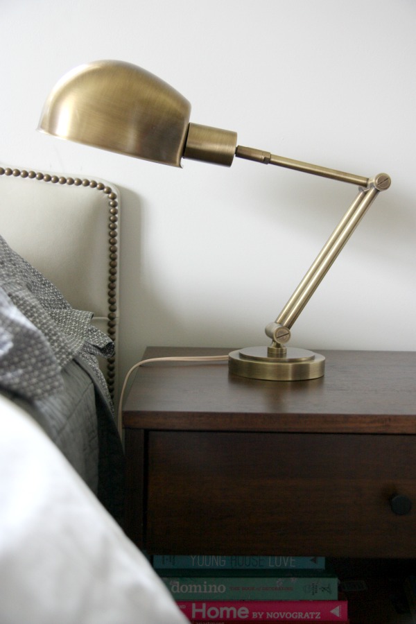
6 – Swing arm lamp This antique brass wall lamp is what inspired the mood board for the bedroom. I’ll be using two – one on each side of our headboard. {I am a read-in-bed girl.} They are the perfect gold stud earrings for our bedroom. I can already envision them against the gray-blue walls and I like what I see.
Surprise, they’re here! I haven’t hung them yet. I need to paint and address the headboard situation first. But I wanted to show you a real life image of them because the finish is amazing. They are definitely more “aged” and less shiny than their listing portrays.
7 – Boucle jute rug Did you notice this rug in the rugrat picture? Rugs + rugrats = my life. This rug is the most expensive rug I’ve ever bought. And it shows. It is so thick and cushy and nubby and I don’t know what took me so long. The natural fibers lighten up all the dark wood pieces and flooring in the bedroom.
8 – Saddle chair Ever since West Elm rolled out this office chair a few months ago, I can’t stop thinking about it. The shape is curvy yet clean. And you know how I feel about stripes.
9 – Willett dresser I scored this vintage dresser on craigslist a while ago. It’s still empty but HH and I think it would be helpful to have a possible worktop in our bedroom. He and I both work from home at times. Sometimes we need to retreat to a closed off room to take/make calls. My thought is to pull a chair {see #8} up to the dresser when necessary and maybe add some open shelving above. We don’t need a true desk. This just might work.
So that’s the big {and some small} stuff. I won’t make any choices on window treatments or bedding until the room is painted and main pieces are installed. I’ll be sure to share my {ever so slow} progress!
Thanks to readers like you and Wayfair for supporting this here blog. I mean that with all my pillow-and-stripe-loving heart.
images: 1-3) Dana Miller for House*Tweaking 4) Wayfair 5) polyvore collage by Dana Miller, linked within 6) Dana Miller
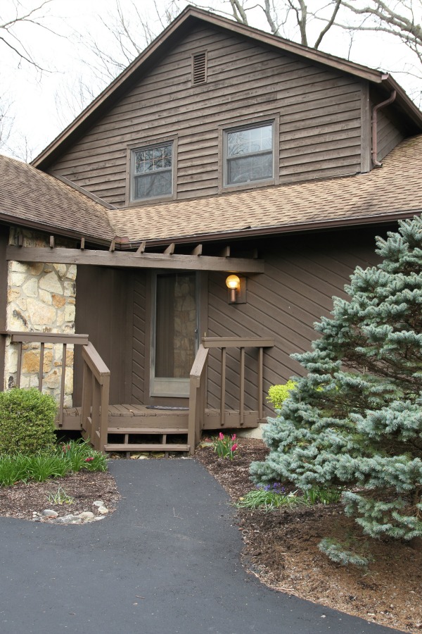
I’ve shared the floor plan and phased facade makeover of our home, so the next logical step would be an interior tour. Let’s start with a tour of how the house looked inside on the day of the inspection, shall we? This tour isn’t meant to be a comprehensive study of each and every corner and closet. (I’ll save those details for individual room tours/makeovers in the future.) It’s more of an overall look at how the spaces flow from one to the next and serves as a baseline for any changes made. That being said, I’ll try to point out the prominent features we were (side- and heart-) eyeing at the time.
Note: The following images are not “pretty.” They were taken hastily on the day of inspection while I was following the inspector around, asking questions and listening to his answers. The lighting is terrible; the focus is blurry. Also, the previous homeowners were in the process of packing and moving at the time these photos were taken. No judgment.
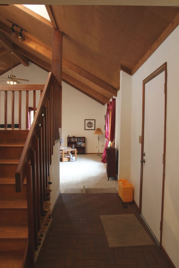
Welcome! This is the front entry looking toward the living area. The front door is on the right and opens up to the side of the staircase. It’s a little odd but not crowded. After living in a ranch where the front door opened directly into the living room, this little entry felt like a luxury! We knew it was big enough for a few small entry staples (slim console table, mirror, shoe basket, etc), but it didn’t feel overly grand or showy – which isn’t our style anyway. It’s the perfect little “hug.” With no overhead lighting and a solid exterior door, this space was inherently dark. We pictured a new door with glass panels to let in ALL. THE. LIGHT. I really didn’t like the finish of the floor tile. (It reminded me of the tile in McDonald’s back in the day.) Notice the step down into the living area. We immediately liked this feature, signaling a transition to a different space.
Fun fact: there was a sign posted on the left that read, “WATCH! STEP DOWN.”
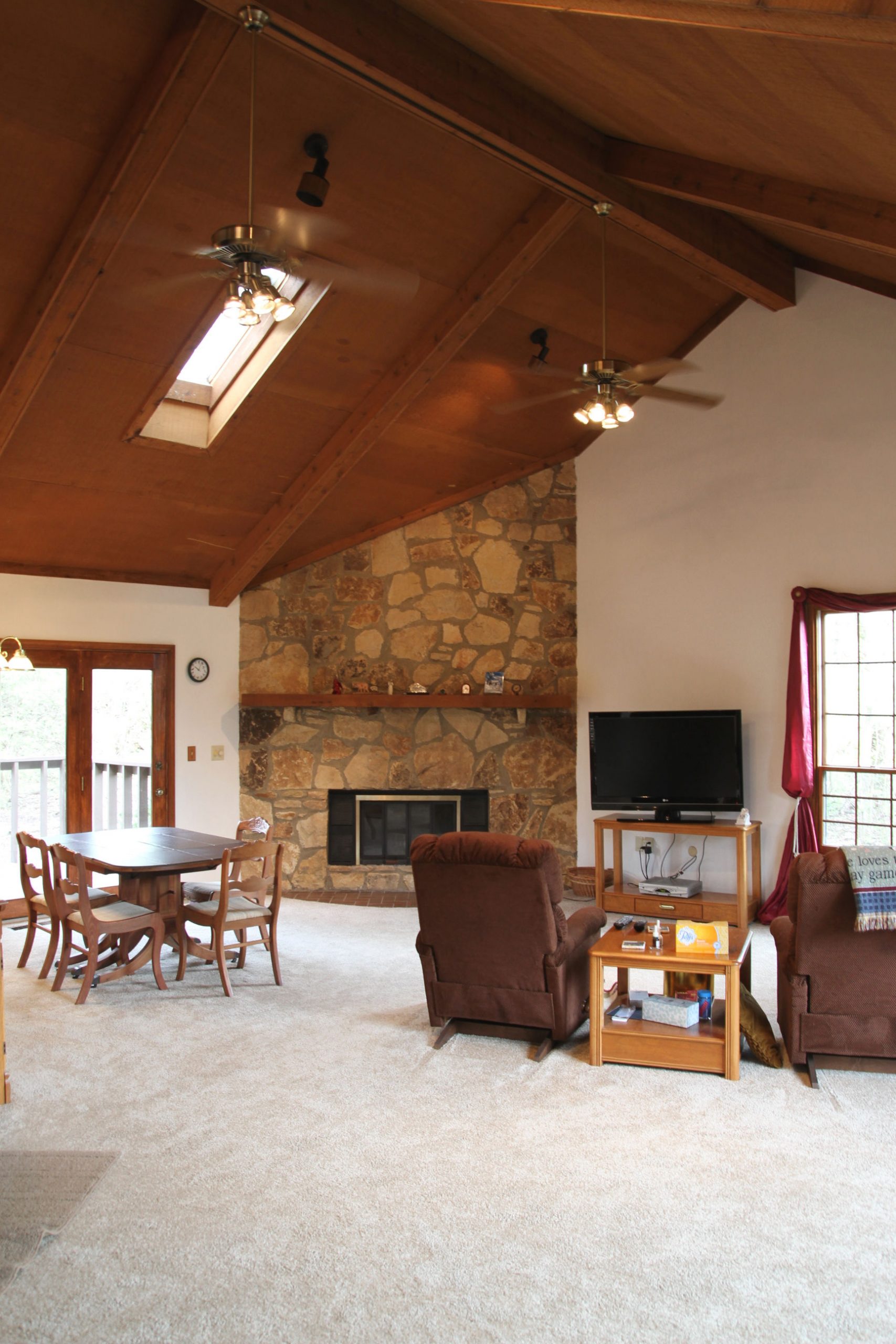
Here’s the open living/dining area after taking that step down. We LOVED all the natural light pouring in from the large windows and a north-facing skylight…so much that we imagined adding a second skylight on the south side. We were also big fans of the vaulted ceiling and wood-burning stone fireplace but were a bit perplexed as to the corner placement of the latter. We weren’t sold on the wood tone of the ceiling but figured it was something we could address later if we didn’t like it. (Spoiler alert: we lived with it and grew to love it.) We weren’t keen on any of the floor coverings (hearth tile and carpet) but they appeared to be in good shape, so we decided they were details we could live with while we addressed more pressing issues…like the ceiling fans and spotlights.
We saw ourselves using this half of the room as a living area with seating and a TV.
This half of the room was well-suited as a dining space with pass-through access to the kitchen (on the left). The French doors leading to the backyard were a selling point, but the teeny deck right outside wasn’t. We also predicted the overhead lighting situation in this area would be…challenging (notice the off-center chandelier)..but it wasn’t a deal-breaker.
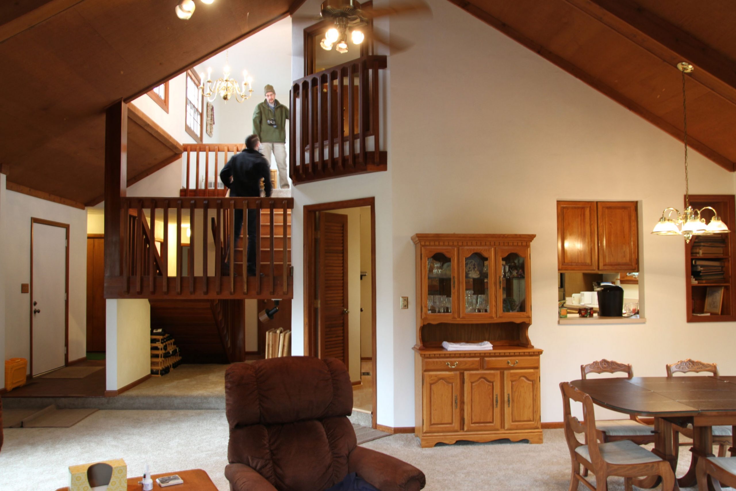
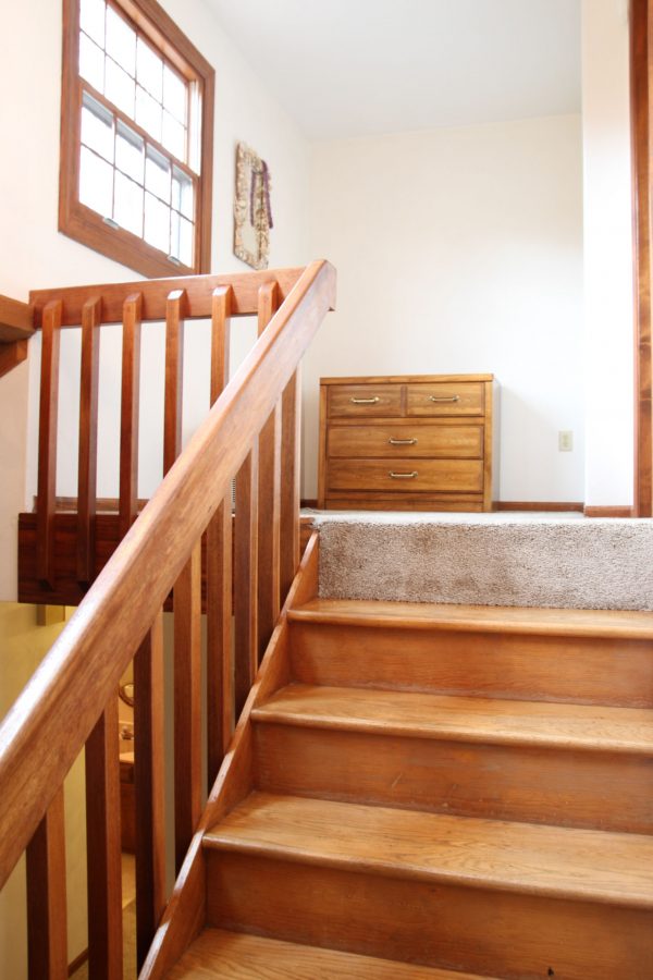
This is the view from the dining/living area looking back toward the staircase and kitchen. See the pass-through on the right? We detested it upon walk-through and still aren’t fans of it visually but do appreciate its practicality;) We felt the swinging louvered doors (shown center) to the kitchen were completely unnecessary. (I removed those suckers the day we moved in.) Notice the open space under the stairs and the *indoor* Juliet balcony off the upstairs bedroom. Gotta love that ’70s quirk! We knew we could turn the unused spot under the stairs into something more, well, usable. I was dead set on closing up the Juliet balcony but, three years in, it’s still there. Let’s just say we could host American Ninja Cat Warrior if approached.
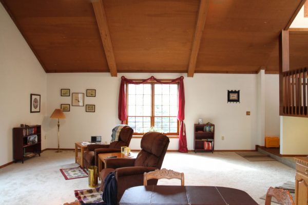
What we most loved about the step-down space was its openness and spaciousness. And, yet, it still managed to feel cozy. With all the weird angles, I knew a more balanced furniture layout and matching bay window/French door curtains would help unify the space.
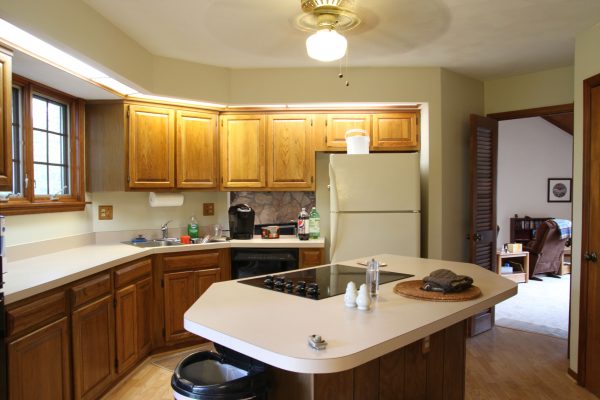
Ah, the kitchen. (See the stone fireplace through the pass-through?) So many angles. Angled doorway to the living room. Angled sink. Angled island. Angled soffit. ALL. THE. ANGLES. There isn’t really anything about the kitchen that we liked other than the overall size, access to the backyard and separation from the living area. (With older kids, we’ve discovered we like the separation.)
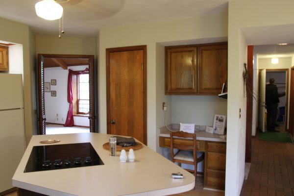
The small pantry and desk area are severely under-utilized. So much wasted space.
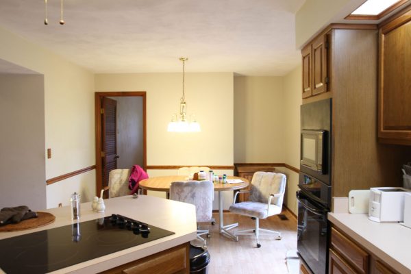
Initially, the small breakfast nook felt nostalgic but it’s proven to be quite pragmatic as well, especially since remote learning and working have taken over the larger dining area during the current pandemic. French doors (just on the other side of the wall oven) lead to the backyard.
As dark (it’s north-facing) and inefficient (it’s really only workable for one person) as it is, upon purchase we were willing to live with the kitchen and brainstorm a complete overhaul. The appliances worked (and still do) so we’re getting our money’s worth until we attempt to streamline the entire layout which will involve nixing all the angles and getting rid of the soffit!
Our oldest nabbed the bedroom off the kitchen. You know, to be closer to the food.
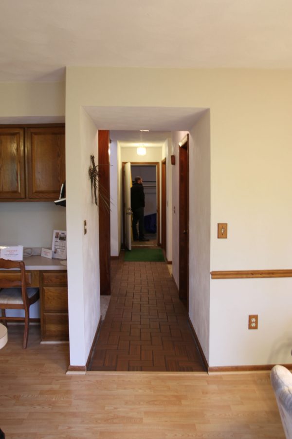
Back out in the kitchen, this is the hallway connecting the kitchen and garage.
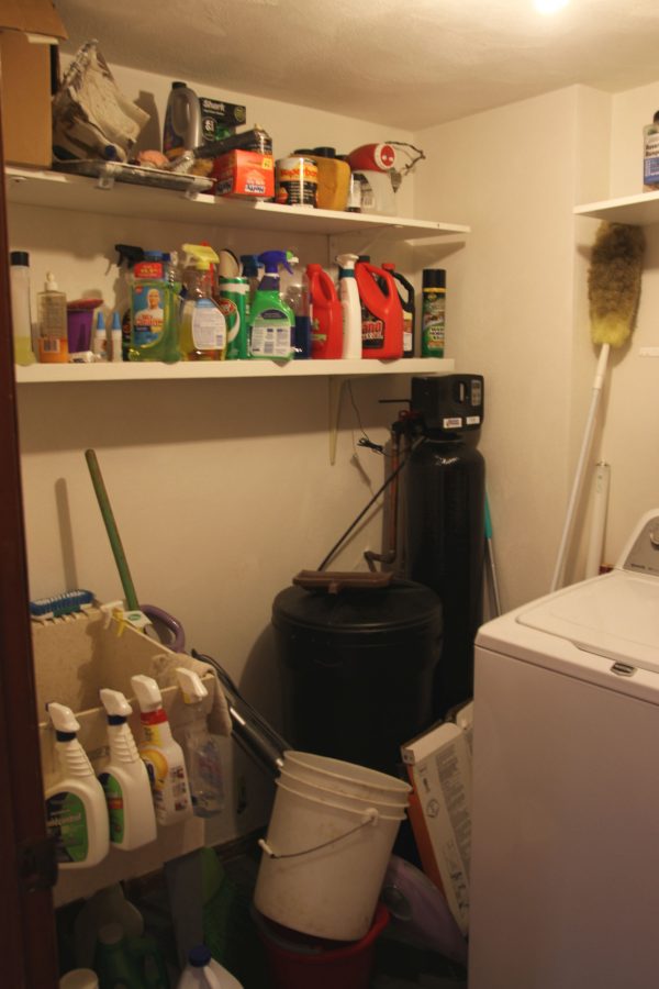
Halfway down the hallway is the laundry/utility room. It’s not a huge room but we were happy to gain a designated laundry space with a door.
Further down the hallway is a shorter hallway that leads to a bathroom (on the left) and two more bedrooms. The forked “intersection” at the end of the hallway had us scratching our heads. Only in a ’70s house!
This is the only bathroom on the first floor. We imagined it serving as both a kid and guest bathroom which we liked. It was decently sized and had a great layout, but we wished it had a window. Since no one in our family spends a ton of time in the bathroom, we were willing to sacrifice a window and vowed to put in better lighting and ventilation instead.
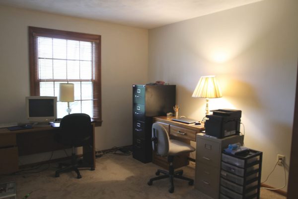
Two bedrooms at the end of the hallway round out the first floor. We liked the fact that we would be gaining a (fourth) bedroom. We also liked that the bedrooms weren’t too big or too small…just right for a bed and desk. We loved the windows in all three bedrooms downstairs. We didn’t love the carpet; overhead lighting was absent. Again, these were cosmetic issues we were willing to wait out and change in the future.
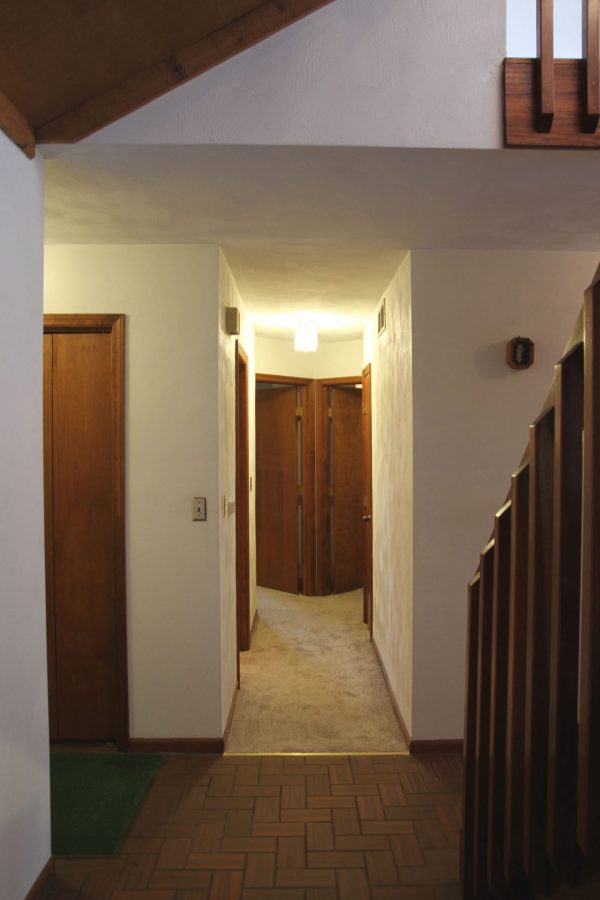
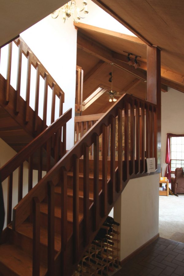
Back down the hallway and on to the second floor! We fell hard for the wide, wood staircase. It screams ’70s. The wood is super warm and handsome, especially on the underside of the staircase. Originally, we tossed around the idea of switching out the railing but over time we’ve grown to embrace it. A landing overlooks the vaulted room. I envisioned a casual gallery of framed photos and art lining the stairwell.
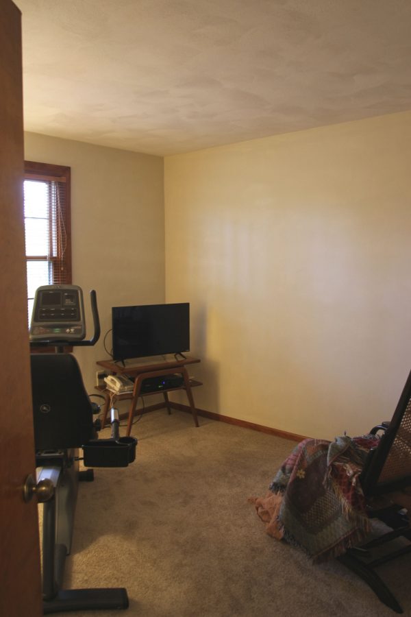
At the top of the staircase is a small loft area. We weren’t sure what exactly we would use it for so dubbed it a flex space and decided to let it evolve organically as we lived in the house. We adore the two windows that flood the stairwell with natural light!
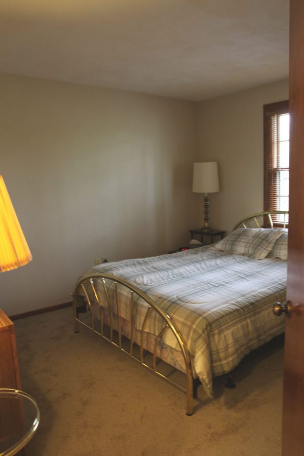
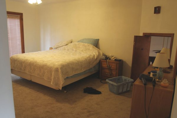
The upstairs bedroom is more generously sized but, still, not huge. It features French doors (on the left) leading to an upstairs deck and an awkward Juliet balcony (on the right) that overlooks the living area. Before touring this house, we’d never considered a floor plan with kid bedrooms on the first floor and a parent bedroom on the second floor. This was our AHA! moment. How amazing would it be to have our own adult space up and away from most other daily activities?! Our kids were older and didn’t need us most nights anymore. The timing was right. We were game. Bring on the adult sanctuary!
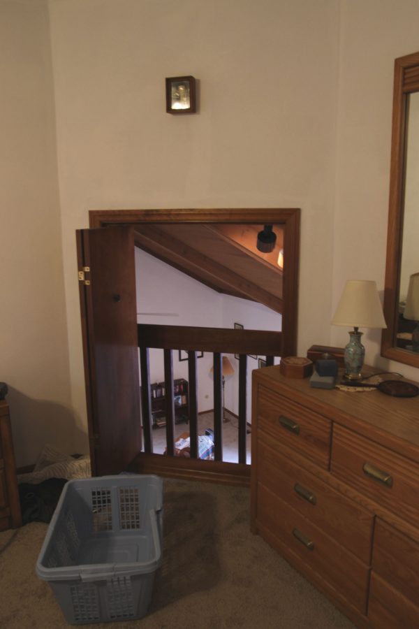
A closer look at that Juliet balcony because that’s not something you see every day! For reference, I’m 5’4″ and the header on that bifold door hits at my collarbone. Whatever your question, my answer is “I have no idea.”
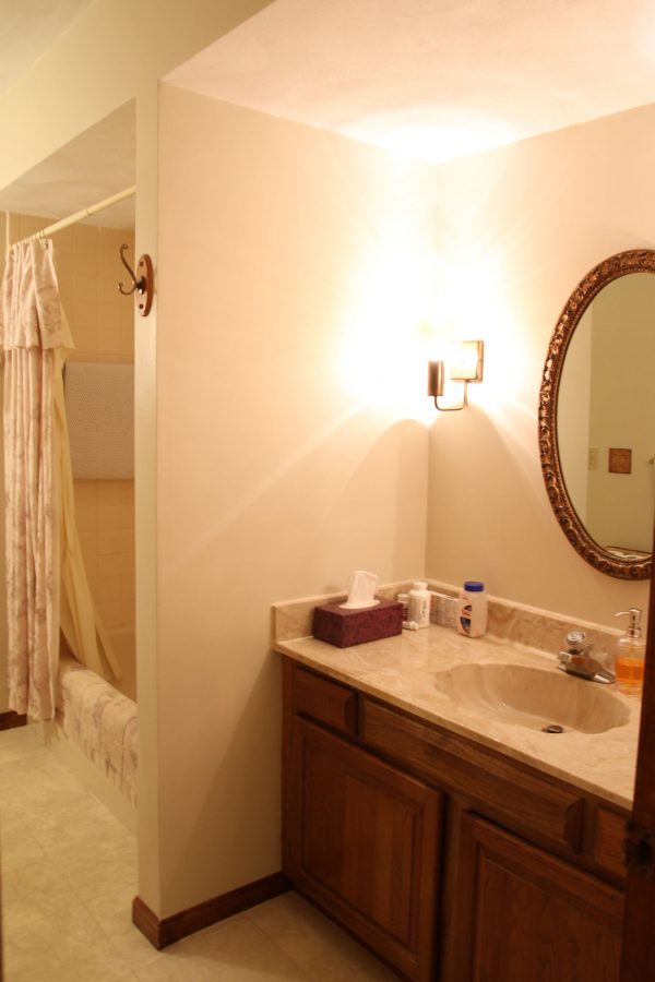
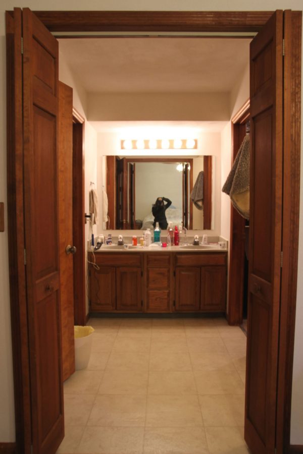
More bifold doors (!) lead to an en suite bathroom and closet. We liked the size of this space and the sight line from the bedroom, but the layout is wonky and windowless. The double vanity was a nice feature.
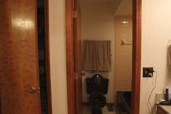
The Chocolate Potty and Tub were not nice features. And there were so many doors! Two bifolds to enter. Two doors on the left (shown above, linen closet & water closet). The small door in the wall behind the towels above the Chocolate Potty is a laundry chute to the utility room.
And two doors on the right (shown above, closet & shower). And, yes, you counted correctly. There are TWO showers in this bathroom. (?!) One standing solo and one combination tub/shower. We predicted we wouldn’t use the tub/shower combo and, three years later, we never have. So, yeah, there’s a lot to contemplate here.
Who knew our adult sanctuary would boast a Chocolate Potty and two separate showers?! Ha!
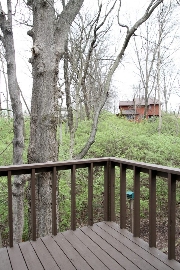
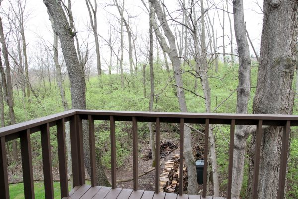
This is out on the upper deck overlooking the backyard. THIS! This is why we fell in love with this place – the woods! Not the deck with the not-to-code railing that small children could slip through.
“Sorry, kids, you can’t come upstairs because this is an adult sanctuary AND YOU MIGHT DIE.”
This photo was taken in early March (of 2017) and things were already starting to green up. The potential of this outdoor space sparked our interest immediately. Whenever possible, we’re outside and we could see ourselves spending a lot of time out here.
And, just like that, we’re at the end of this before tour! Much like the exterior, the interior of the home was VERY BROWN and sported lots of ’70s flair – some of which we appreciated (vaulted ceilings, wide staircase, stone fireplace, skylight) and some of which left us puzzled (angles upon angles! indoor balcony! mini-loft! Chocolate Potty!)…yet oddly bewitched. We’d never experienced a house quite like this one and that made us love it even more. I’ve said it before and I’ll say it again, we’re committed to NOT making this house something it isn’t. We’re happy to call it home, quirks and all!


budget decor, inspiration, interior design, mood board