You already saw our kitchen go from this…

…to this…

Yeah. That was a complete gut job. Since then, we’ve been doing what we do best. Tweaking.

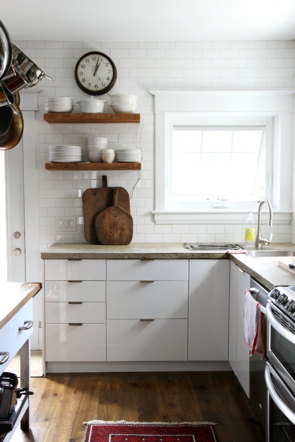
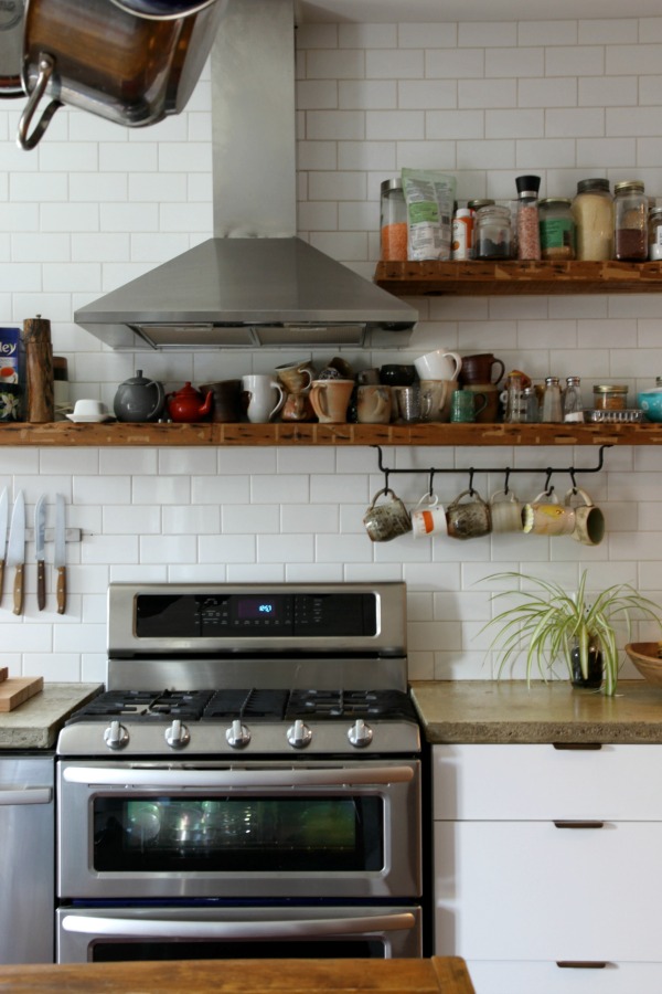
We originally installed four open shelves near the range. They were totally functional and got me on the open-shelving-in-the-kitchen bandwagon but left a lot to be desired. The white MDF boards got lost against the light-colored wall and looked a little meh. A reader with a keen eye also noted that the shelves seemed too low and would look better if they were in line with the hood.
We lived with them that way for a few months. I really liked having our everyday serving ware {plates, bowls, glasses, etc.} out in the open for quick access but felt that something was off. I went back through my kitchen inspiration photos and noted that many incorporated wood shelving. And after I looked further, I noticed that {as the wise reader above had suggested} the open shelving was in line with either: 1) a range hood 2) wall cabinets or 3) both. Aha!
I mentioned to HH that I thought the shelves would look better if they were raised so that the top shelves were in line with the hood and the bottom shelves were in line with the bottom of our wall cabinets {on the perpendicular walls}. He just looked at me.
He didn’t say a word but I’m pretty sure he was thinking, “What?! I just hung those shelves. They’re not going anywhere.”
Then I added, “And wouldn’t it be nice if we could find some reclaimed wood to replace the MDF?”
Still, the look and no words. This is what HH has to put up with on a daily basis. Have pity on him.
But I had planted a seed. And eventually it sprouted some roots because a few weeks later HH told me we had a few fence boards leftover from our DIY ‘love’ headboard. On top of that, they were 1″ thick – exactly what we needed. He thought we had enough to replace the MDF shelf boards. He also said something about installing a backsplash while he was at it.
I love that man.
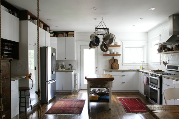
I’ll have full-on ‘how we did it’ posts next week but feast your eyes on this…

How you like dem apples?
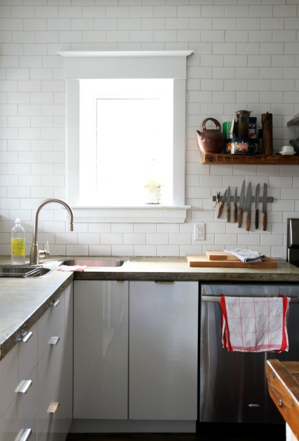
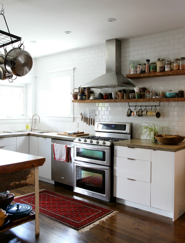
First, let’s discuss the most obvious tweak. The backsplash.

We chose 2″x12″ white subway tile and a contrasting warm gray grout.

We decided to tile up to the hood but not to the ceiling because we really didn’t want the hood to be an ‘in your face’ focal point from the adjoining family room.

Likewise, we chose to only go three tiles high with the rest of the backsplash. Don’t get me wrong. I do enjoy an entire wall of tile now and again but when it’s visible from a not-so-utilitarian space {like our wide open adjoining family room} then it feels a little cold to me. Not to mention, keeping our backsplash minimal saved us time and money. Unless your kids are doing the cooking in your house {in which case TELL ME YOUR SECRET}, you really don’t need a backsplash that extends to the ceiling.

It’s hard to tell from this shot but the low backsplash wraps around under the microwave.

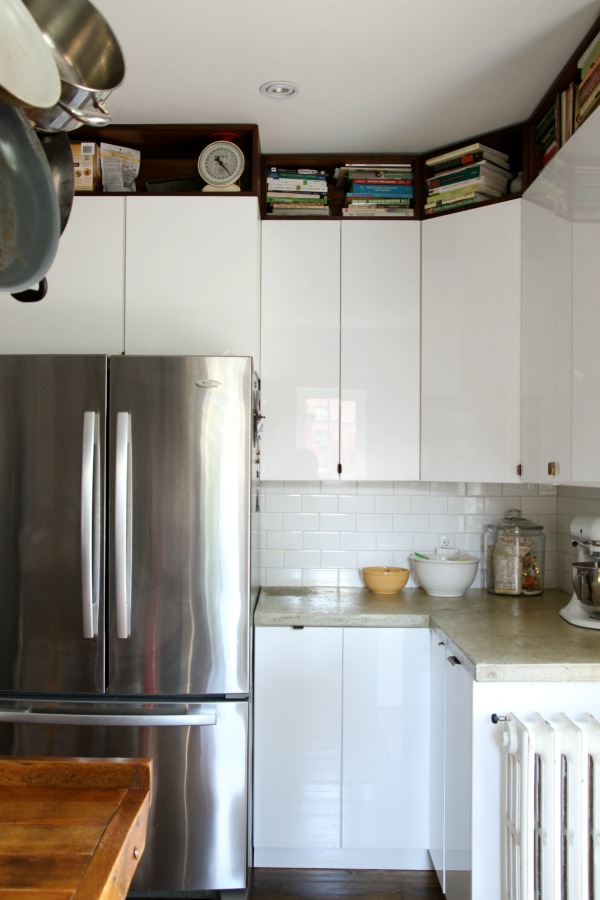
No backsplash along the desk area. I’m reserving the under-cabinet space for an inspiration board, memos, reminders, etc.
Now for the less obvious tweak. The reclaimed wood shelves…

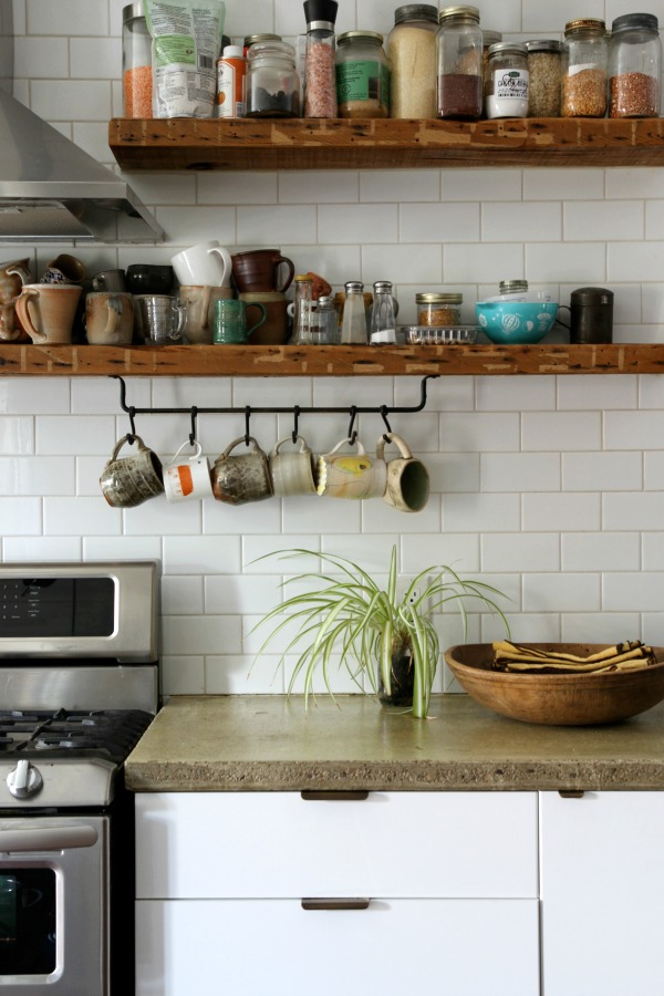
Seriously. They might be my favorite thing in the entire kitchen. Besides the skylights. The wood is old fence boards from HH’s family farm back in Pennsylvania. Like I mentioned, it was from the same lot that we used to DIY our previous headboard. {Don’t worry. HH sealed it so there’s no risk of contaminating our dishes with nasty chemicals or harmful dust.}

This shot shows how the raised shelves follow the lines of the kitchen better. I liken their new, higher position to a good {not Joan Rivers} facelift. It’s like that’s where they were supposed to be all along. Oh, and I have no problem reaching stuff on the shelves at their current height. At 5’4″, that was a slight concern for me but, turns out, it’s just like reaching up into a wall cabinet for something on the bottom or middle shelves.


The wood isn’t perfect. It’s bowed and warped which did pose somewhat of a challenge to hang. It has an aged patina that can’t be bought and only comes with time. We purposefully left some of the old paint on the boards.

Each shelf is actually made up of two boards placed side by side. Since we reused the IKEA brackets, HH had to cut the boards length and width wise to fit. Even though there are two boards and they aren’t perfectly smooth, it’s not enough to make our dishes wobble precariously above us.

I love the function of the open shelving so much that I bought two more brackets and we added a low shelf over near the fridge for easy water drinking. {See how the backsplash continues along this wall?} The height of the shelf is in line with the backsplash and still allows us to utilize the electrical outlets properly. This corner needs work. I want to hang the paper towel roll and I’ll probably remove the coffee maker since we rarely use it.

HH was worried the area under the shelf would be wasted but it’s perfect for storing cutting boards.
Some more shots because I can’t enough of the reclaimed wood and it’s Friday!


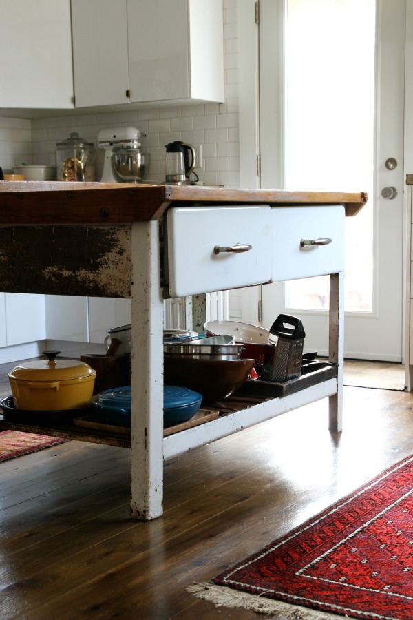
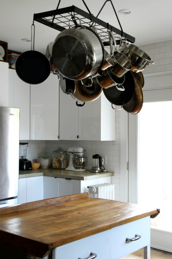
The mix of the shiny white tile, glass globe pendants, stainless steel brackets & appliances, weathered wood shelves, warm walnut island top, dark lower cabinetry and aluminum stools are so us. We love the contrast of light + dark, old + modern, shiny + matte.
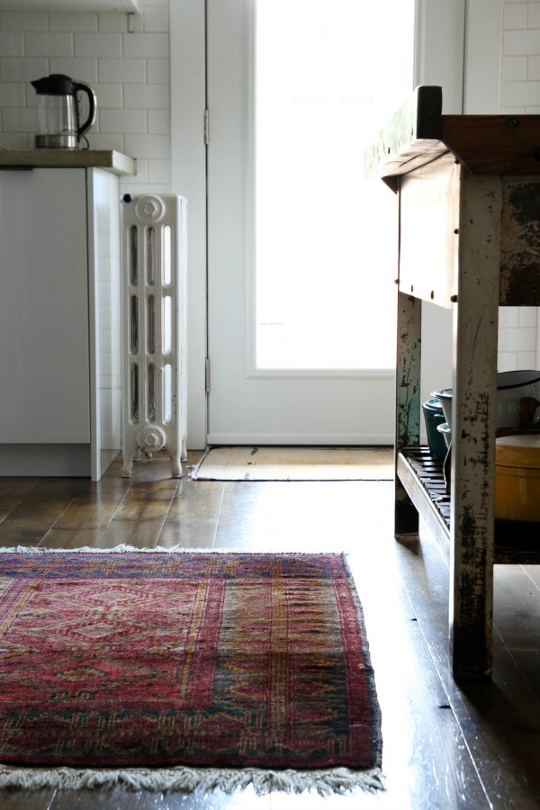
I still have a short list of things to add to the kitchen, mostly final touches and accessories: window treatment, rug, maybe some hooks under the lower shelves near the range for towels/kitchen tools, wall art to the left of the window, etc.
Last week, one reader guessed another addition to the kitchen…

Cabinet lighting. {I’ve yet to paint those damn french doors. Why?! It’s not that hard!}

HH installed it himself. I have no idea how. I’m clueless when it comes to electrical work. I do know our electrician-in-law {who did the rest of the electrical work on the house} ran supply wire and hooked it up to switches so the cabinet lighting turns on/off with the flip of a switch. Presto! If you have any questions about it, feel free to ask in the comments section and maybe HH can answer them. I’m sorry. I have no desire to be an electrician.

But I do love what lighting can do for a space. I wish I could capture the ambience of the cabinet lighting at night. It’s the only lighting we use in the great room in the evenings after the kids are tucked in bed, lunches are packed for the next day and the kitchen is cleaned up. Cabinet lighting – that’s about as romantic as we get, people.
One last thing before I go…THANK YOU for voting for Mabrey’s room in the Room for Color contest over on Apartment Therapy. We won the dark division! I couldn’t have done it without you.
Have a happy weekend! I’ll be attempting a weekend warrior project that involves paint. Fingers crossed the kids cooperate.
Click here to see who won this week’s Bona giveaway.
images: Dana Miller for House*Tweaking


budget decor, DIY, interior design, renovation