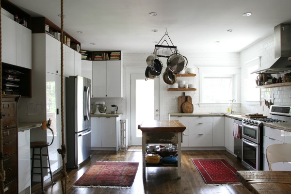
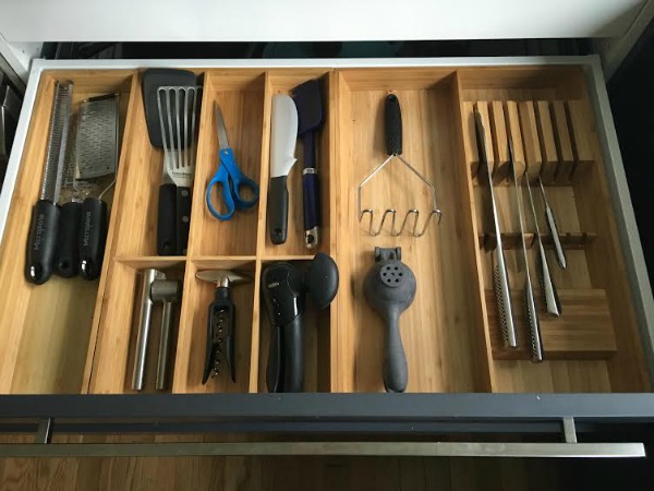
More than half of the Airbnb homes we’ve stayed in boast IKEA kitchens. It’s not something I specifically look for in a vacation rental (I swear!), but I do get a little giddy the first time I open a drawer and make the discovery. I love seeing how other homeowners use IKEA cabinets within the context of their own homes. I think IKEA kitchens are becoming so popular because they’re affordable, efficient and customizable, and the drawer hardware holds up to daily abuse.
The Toronto house we stayed in utilized IKEA cabinets alongside other elements to create a rustic modern aesthetic. I thought I’d share it with you because, at first glance, the space doesn’t read IKEA. It feels lived in and exudes the same cozy vibe as the rest of the home. Keep reading to see some of the defining features.
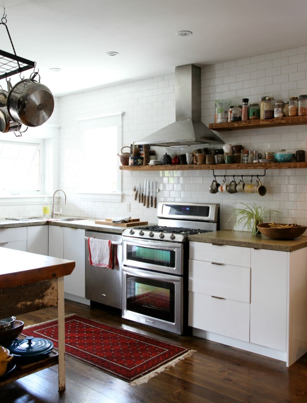
Sleek cabinets + concrete countertops + wood floors
White, flat panel cabinets in a high gloss finish (IKEA RINGHULT) are topped with matte concrete countertops for contrast. The concrete wasn’t perfectly mixed or polished on purpose. Pits and color variations give the inexpensive material the look of pricier natural stone. The rawness of the concrete contributes to the rustic look. Pine planks ground the space and give off a pretty golden glow.
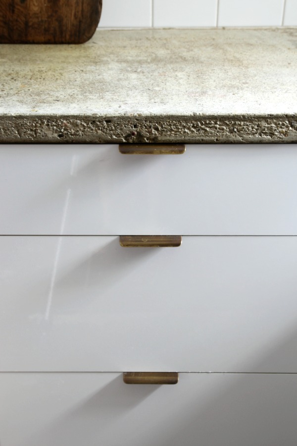
Minimal brass hardware
Solid brass edge pulls offer a clean design of a quality material. In line with the lived-in vibe of the house, the un-lacquered brass has taken on a patina over time. These particular pulls hail from Upper Canada Specialty Hardware, but Rejuvenation sells similar ones here.
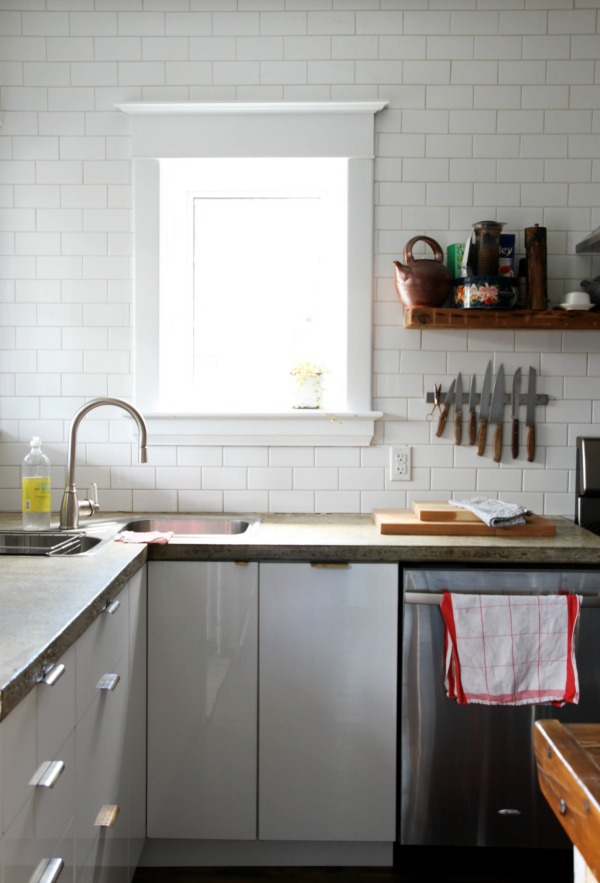
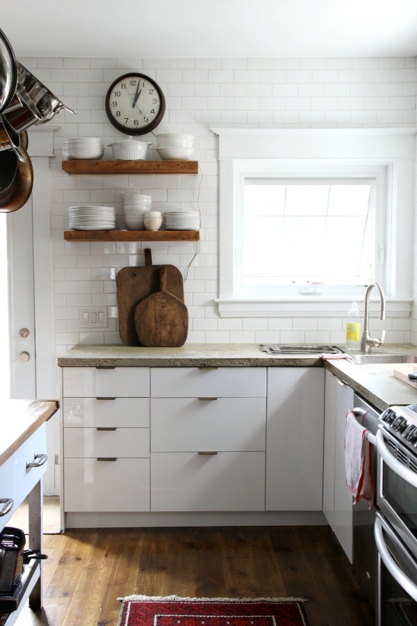
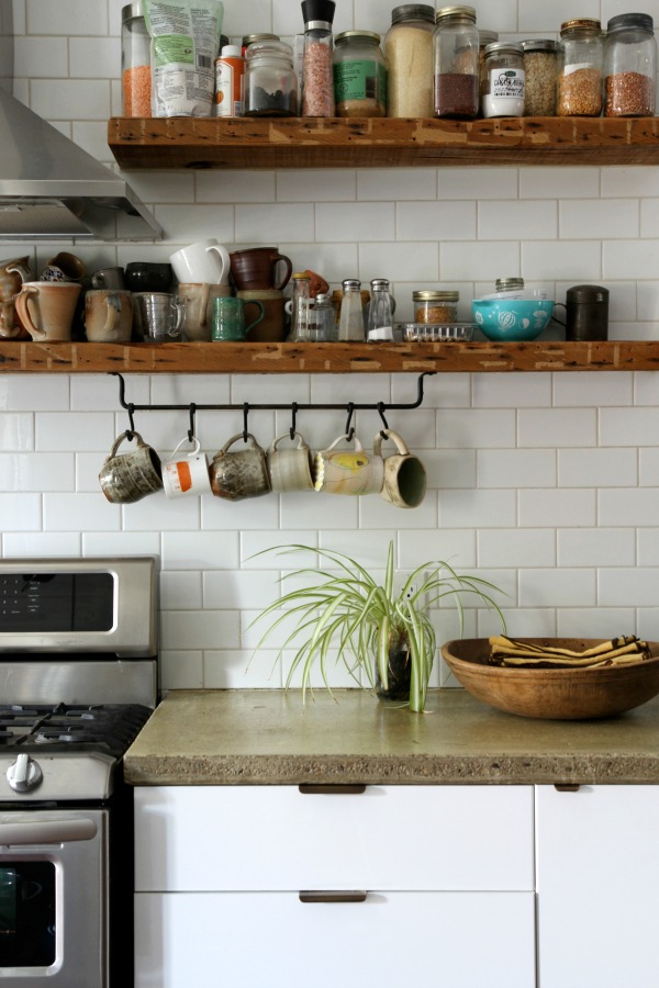
Tiled walls
Taking the subway tile to the ceiling is a popular, contemporary installation of a classic material. Here, it adds another layer and texture to the utilitarian space. Fortunately, white 3″ x 6″ subway tile can be found for cheap at most home improvement stores.
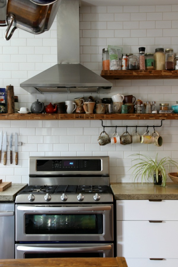
Wood shelves
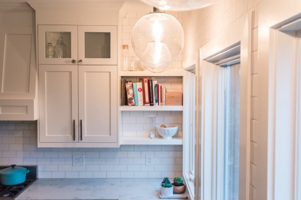
Forgoing upper cabinets on one half of the room gives the kitchen a lighter, airier feel. Thoughtfully placed reclaimed wood shelves in various lengths bring warmth to the tiled walls. A haphazard display of handmade mugs and cooking essentials feels casual and homey.
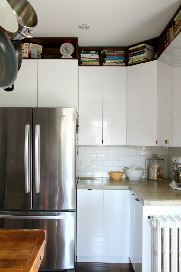
Open cubbies above wall cabinets
On the other half of the kitchen, a row of open cubbies fits snugly between upper cabinets and the ceiling. (Here, the cubbies were created by simply using horizontal IKEA wall cabinets in a wood lookalike finish – similar to this – and opting out of door fronts.) The cubbies break up the wall of cabinetry and make use of otherwise wasted space. The overall look is tidy and modern. The homeowners use the clever cubbies to stash their cookbook collection and less frequently used items.
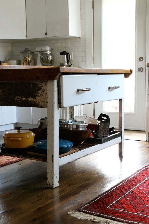
A freestanding, antique island
An old farmhouse island takes center stage in the middle of the room. The worn wood top and rusted metal base give the new kitchen a sense of history while also providing extra prep and storage space. The drawers hold kitchen linens, and the bottom shelf keeps mixing bowls and a pair of colorful dutch ovens within easy reach.
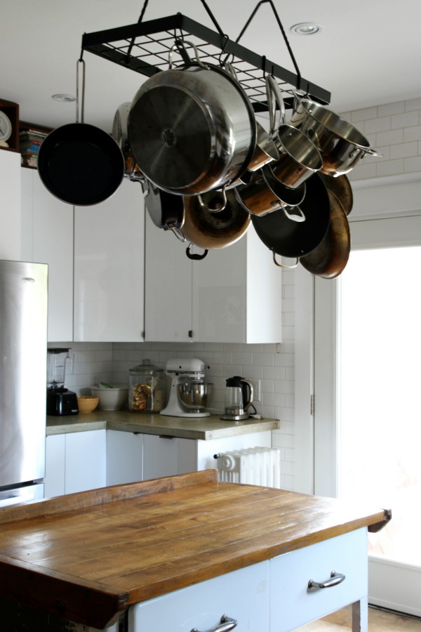
A pot rack
An overhead pot rack makes use of vertical space above the island. The hanging pots and pans are reminiscent of a chandelier, reflecting light and the warmth of the wood-topped island below. The homeowners thrifted this rack, but you can find similar black, rectangular versions online.
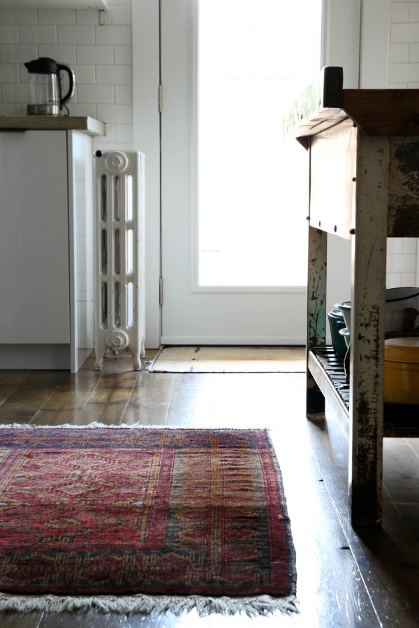
Vintage rugs
Vintage rugs in saturated hues add color and pattern to the mostly white space and feel soft and warm underfoot. The rugs shown here are family hand-me-downs, so not only do they look great, they tell yet another story. Try searching “vintage rug” or “persian rug” on eBay or etsy.
What do you love most about this kitchen? I don’t think I can pick just one thing! I love the mix of old and new and all the contrasting materials. In person, I loved the patina of the concrete countertops, brass pulls and industrial island against the shiny, modern cabinets. (When we returned home, I may have trolled Craigslist looking for crusty, industrial metal legs to add a butcher block top to.) The pine floors were so handsome in real life, scratches and all. Even though the kitchen is probably the hardest working room in this house, the entire space felt really warm and inviting. It was obvious the family who lives here actually lives here. Which is the point, right?
P.S. – See more of this beautiful home right here. Read about our family trip to Toronto here.
images: Dana Miller for House*Tweaking
It seems the consensus is that you guys would like to continue seeing and reading about IKEA kitchens regardless of which cabinet line – AKURUM (previous) or SEKTION (current) – is featured. For that reason, I will continue to share the best of the bunch that come my way. Thanks for reading!
Obligatory preamble rambling: When we were renovating our kitchen, I searched high and low for any information I could find on IKEA kitchens. The results were few and far between. We did end up with an IKEA kitchen (which we love) but I’d like to shed more light on IKEA kitchen renovations from the perspective of other real life homeowners. It’s something I wish we would have had access to when we were considering IKEA for our own kitchen remodel. Plus, it’s fun to see how others use IKEA to suit their personal style and needs in the kitchen. I hope you find these posts helpful and inspiring – whether you ultimately end up with an IKEA kitchen or not. Enjoy!
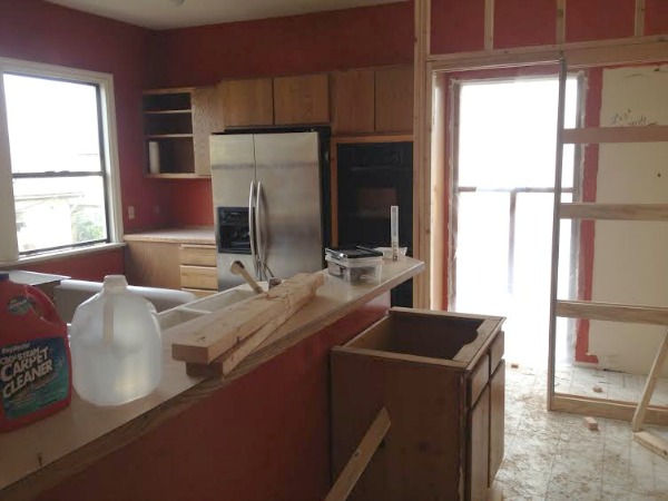
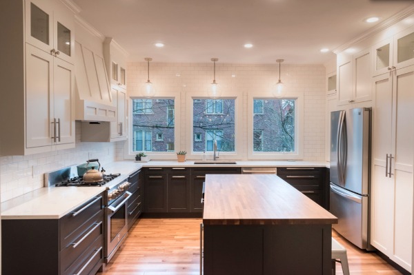
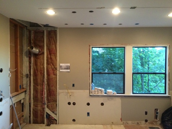
Three years ago, Sarah and her husband, Drew, bought a 1902 fixer upper in Seattle. While they were impressed with the size of the kitchen, the finishes and layout left a lot to be desired. The red walls, orangey oak cabinets, pink countertops and peeling linoleum floor had to go, but the new homeowners didn’t have resources for a complete overhaul. Over the course of a week, they painted the walls and cabinets, added inexpensive hardware, applied marble contact paper to the countertops and installed wood lookalike peel-and-stick flooring. They affectionately referred to the mini makeover as their “stick on” kitchen. It bought them some time to live in the space and figure out what did (big windows!) and didn’t (angled stovetop + hood, peninsula) work. Two years later, they tackled a full-on remodel and utilized IKEA cabinet frames. I asked Sarah several questions about the project. See her answers and the incredible results below!
Which items in your kitchen hail from IKEA?
We bought the cabinets and hinges from IKEA. We sourced all other items elsewhere.
What made you decide to source these items from IKEA?
There were three things that sold us on IKEA: 1) The hinges are really high quality. Every time I go to IKEA I just want to open and close all the drawers. 2) All of the accessories fit perfectly! I know that seems minor, but I love that our utensil divider doesn’t jostle around in the drawer. The same goes for our pantry organizers. Once the cabinets are in, it’s so much easier to find/make the perfect place for everything. 3) We read so many great reviews. It seemed everyone who had installed an IKEA kitchen was happy with their decision. Most complaints were about the installation process, but we had planned to outsource that anyway.
Who designed your kitchen? What aesthetic were you aiming for?
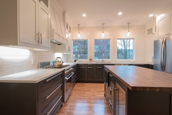
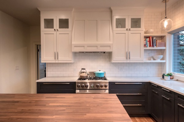
We hired a designer to reconfigure the space and make sure all measurements were correct. She helped us determine the size of the island and ensured adequate space for traffic flow. (If I would’ve designed it alone, the island would’ve been way too big!) We chose all the finishes and fixtures ourselves. We wanted a kitchen that felt clean and modern but not totally out of place in our 1902 house. The shaker doors are timeless, but the way we used the subway tile to cover entire walls immediately spruced up the space.

Did you assemble and install all IKEA kitchen components yourself? If not, what did you seek help with?
We hired a contractor, NW Homeworks, who specializes in IKEA installations. They put together our shopping list and assembled and installed everything.
How did you customize your IKEA kitchen to suit your needs and preferred aesthetic?
We customized almost everything! The doors and drawer fronts are custom. We bought the sink, appliances, countertops and hardware from non-IKEA sources as well. When we bought our home, I wanted to remodel on day one, but I’m glad we waited. Two years later, we had a very specific idea of what we wanted. Our designer helped with the new layout, but we selected every detail of the design.
How long was it from design to the final product?
It took us about a month to complete the design. We went back and forth several times on the configuration of the room. We moved the sink, and once I wasn’t locked in by plumbing/gas lines, I wanted to try everything! From demo to completion, it took nine weeks.
How long have you lived with your IKEA kitchen? Have you encountered any problems?
We’ve lived with our new kitchen for six months, and, so far, we love it! It’s beautiful to come home to at the end of each day, and it’s just so functional. I know where everything is which makes cooking and cleaning up so much easier and quicker. It’s super efficient.
What is your favorite thing about your kitchen? Least favorite?
I love the new layout. We reconfigured the whole space which really made it more open and user-friendly. Originally, we were going to keep the same configuration because it was cheaper, but we realized that, once we got the layout right, it would be easy to update the space over time. If we ever decide to repaint the cabinets or replace the countertops, we can. By far, spending extra to get the layout right was the biggest and best decision we made.
The only thing I would do differently is nix the upper cabinet lighting. During the design process, I thought warm light streaming through the glass front cabinets would be so cozy, but I seldom remember to turn them on! I think I’ve turned them on twice.
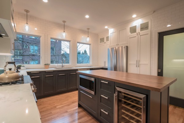
I noticed there’s a microwave and wine fridge in the island. Would you mind sharing your thoughts on (the placement of) those appliances?
I hate the way microwaves look, but I’ve always missed their usefulness when we’ve gone without one. Putting the microwave in the island solved the eyesore problem. For the most part, it’s been great. Initially, it was annoying because the buttons aren’t at eye level, but, I learned the layout of the keypad and no longer have to squat down to look at the buttons and it’s totally fine.
We could probably do without the wine fridge, mostly because we weren’t able to find a great mid-grade option. There are cheap ones that are really loud and quiet ones that cost thousands but, at least in the size we needed, they’re weren’t any good quiet, affordable options. I drink sparkling water like it’s my job. It’s been nice for that, but it’s one of the least used items in the kitchen.
What’s behind the black pocket door?
The short answer: A powder room.
The long answer: The backstory on our house is actually pretty crazy. The Seattle housing market is nuts, especially if you are a first-time home buyer and have no idea what you’re doing. Prior to buying our house, we lived in a small apartment (only 600 square feet!) in Capitol Hill. We loved the neighborhood and wanted to stay close, but we were basically stuck choosing between small apartments or million dollar houses. When we came across affordable family homes, they would sell within 48 hours for well above asking price. Then our amazing realtor introduced us to a builder who had just bought the old house we live in now. The house was on a sizable lot, and the builder’s plan was to move it forward and build three townhouses in the backyard. The previous owners had added an addition to the back that would have to be removed to make room for the new townhouses. He offered us the house and we saw it as great opportunity to live in the Capitol Hill area while still gaining square footage and not overspending.
Looking back, it was an insane way to purchase a first house because it was so complicated. They literally picked up our house (with its 115-year-old chimney) moved it forward ten feet, poured a new foundation and then set the old house down on the new foundation. We would drive by when the house was in the air (for several weeks!) and just hold our breath. Thankfully, it worked out. The builder began moving the house in January, and we moved in by July. We got a new foundation out of the deal which is great for a house our age.
Most old Seattle houses don’t have a bathroom on the main floor which is why the previous owners had added on to the back of the house. (The addition contained a storage room and a full bath.) Since the builder had to remove that part of the house, he added a half bathroom accessed by a pocket door so we would have a bathroom on the main floor.
Would you recommend IKEA as a source for a kitchen remodel? If so, which items?
We can only speak for the cabinet frames, drawers and hinges, but, for those, we would highly recommend IKEA!
Would you consider IKEA for a future kitchen remodel?
Definitely.
Resources of note:
cabinets, drawers, hinges – IKEA
lower cabinet paint – Benjamin Moore wrought iron
upper cabinet paint – Benjamin Moore white dove
drawer fronts and doors – Unhinged Custom Doors
pendants – 8″ globe pendants, West Elm
pendant lightbulbs – Rolay 60W edison style vintage filament
tile – Daltile rittenhouse 3″ x 6″ subway tile, Home Depot
countertops – carrara grigio quartz
sink – Blanco precis super single bowl in cinder, Amazon
hardware – Pi square pull bar
paper roller – George and Willy
island counter – walnut butcher block, The Woodworkers’ Candy Store
fridge – Kenmore elite french door
stove – Kenmore pro dual fuel range
dishwasher – Bosch 500 series
microwave – LG (We have the same microwave and love it! – Dana)
Thanks, Sarah, for sharing your kitchen! It’s beautiful.
What a transformation! I think Sarah and Drew’s decision to get the floor plan right was smart and will prove to be a worthy investment in the long run. Nixing the angled stove/hood and opting for an island over a peninsula completely changed the way the space works and looks. Did you notice the addition of a window to form a trio of windows above the sink area? Who wouldn’t want to wash dishes with that view?! I love all the classic material choices. Even though it’s a tuxedo kitchen (dark lower cabinetry, white upper cabinetry), it feels timeless. My favorite design moment is the open shelving in the corner. It helps to break up all the upper cabinetry and built-in hood. Not to mention, it’s a clever spot for stashing cookbooks.
Want more inspiration? You can find an entire IKEA kitchen series by clicking the See Real IKEA Kitchens button in the side bar.
Do you have a project (big or small, IKEA or non-IKEA) that you would like to share with House*Tweaking readers? Email me at housetweaking (at) gmail (dot) com for consideration. Thanks in advance!
images: NW Homeworks


budget decor, DIY, IKEA kitchens, inspiration, interior design