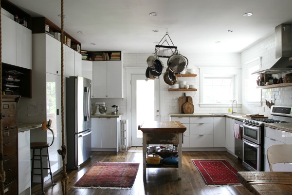
More than half of the Airbnb homes we’ve stayed in boast IKEA kitchens. It’s not something I specifically look for in a vacation rental (I swear!), but I do get a little giddy the first time I open a drawer and make the discovery. I love seeing how other homeowners use IKEA cabinets within the context of their own homes. I think IKEA kitchens are becoming so popular because they’re affordable, efficient and customizable, and the drawer hardware holds up to daily abuse.
The Toronto house we stayed in utilized IKEA cabinets alongside other elements to create a rustic modern aesthetic. I thought I’d share it with you because, at first glance, the space doesn’t read IKEA. It feels lived in and exudes the same cozy vibe as the rest of the home. Keep reading to see some of the defining features.
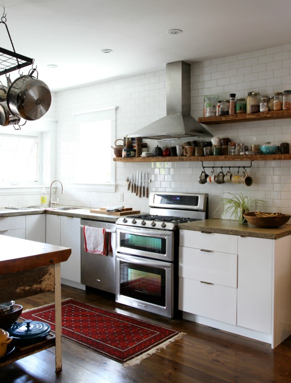
Sleek cabinets + concrete countertops + wood floors
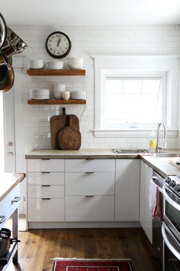
White, flat panel cabinets in a high gloss finish (IKEA RINGHULT) are topped with matte concrete countertops for contrast. The concrete wasn’t perfectly mixed or polished on purpose. Pits and color variations give the inexpensive material the look of pricier natural stone. The rawness of the concrete contributes to the rustic look. Pine planks ground the space and give off a pretty golden glow.
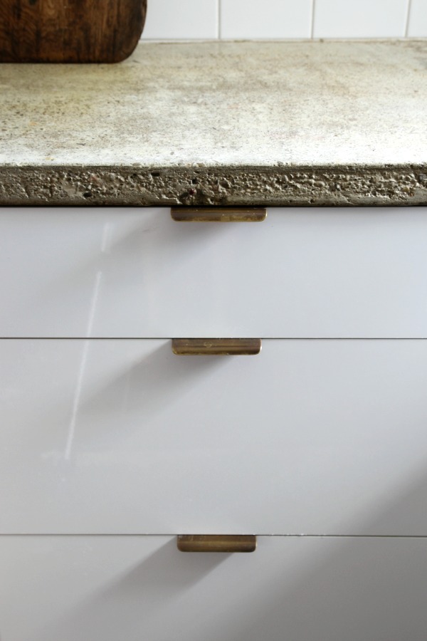
Minimal brass hardware
Solid brass edge pulls offer a clean design of a quality material. In line with the lived-in vibe of the house, the un-lacquered brass has taken on a patina over time. These particular pulls hail from Upper Canada Specialty Hardware, but Rejuvenation sells similar ones here.
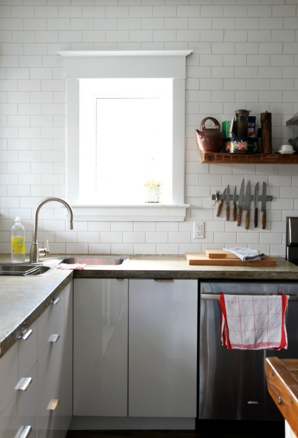
Tiled walls
Taking the subway tile to the ceiling is a popular, contemporary installation of a classic material. Here, it adds another layer and texture to the utilitarian space. Fortunately, white 3″ x 6″ subway tile can be found for cheap at most home improvement stores.
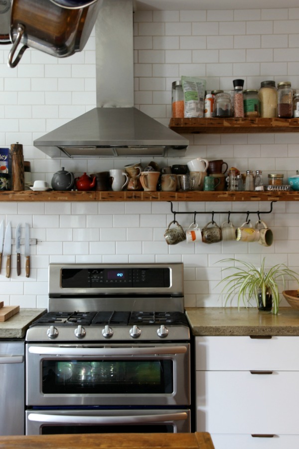
Wood shelves
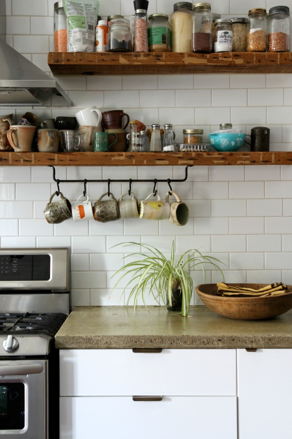
Forgoing upper cabinets on one half of the room gives the kitchen a lighter, airier feel. Thoughtfully placed reclaimed wood shelves in various lengths bring warmth to the tiled walls. A haphazard display of handmade mugs and cooking essentials feels casual and homey.
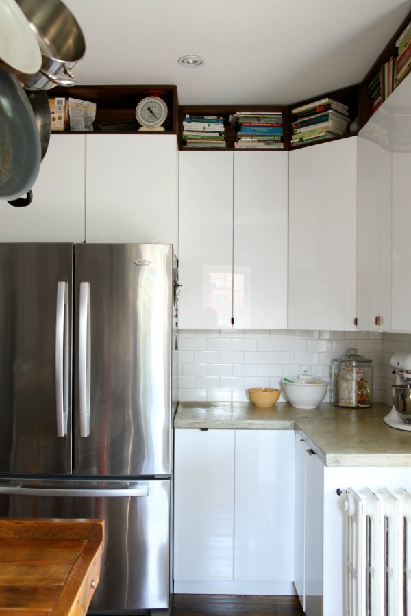
Open cubbies above wall cabinets
On the other half of the kitchen, a row of open cubbies fits snugly between upper cabinets and the ceiling. (Here, the cubbies were created by simply using horizontal IKEA wall cabinets in a wood lookalike finish – similar to this – and opting out of door fronts.) The cubbies break up the wall of cabinetry and make use of otherwise wasted space. The overall look is tidy and modern. The homeowners use the clever cubbies to stash their cookbook collection and less frequently used items.
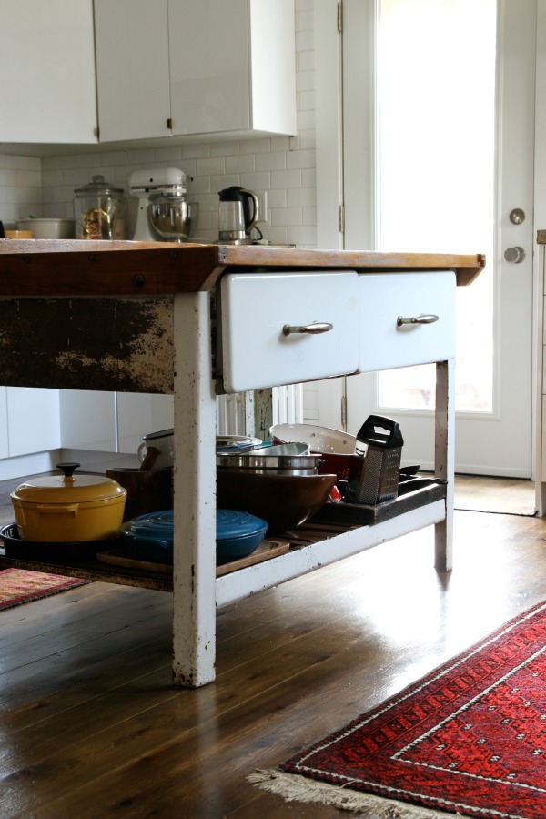
A freestanding, antique island
An old farmhouse island takes center stage in the middle of the room. The worn wood top and rusted metal base give the new kitchen a sense of history while also providing extra prep and storage space. The drawers hold kitchen linens, and the bottom shelf keeps mixing bowls and a pair of colorful dutch ovens within easy reach.
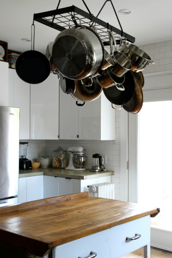
A pot rack
An overhead pot rack makes use of vertical space above the island. The hanging pots and pans are reminiscent of a chandelier, reflecting light and the warmth of the wood-topped island below. The homeowners thrifted this rack, but you can find similar black, rectangular versions online.
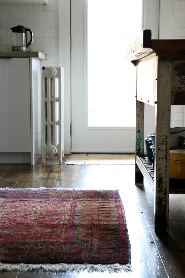
Vintage rugs
Vintage rugs in saturated hues add color and pattern to the mostly white space and feel soft and warm underfoot. The rugs shown here are family hand-me-downs, so not only do they look great, they tell yet another story. Try searching “vintage rug” or “persian rug” on eBay or etsy.
What do you love most about this kitchen? I don’t think I can pick just one thing! I love the mix of old and new and all the contrasting materials. In person, I loved the patina of the concrete countertops, brass pulls and industrial island against the shiny, modern cabinets. (When we returned home, I may have trolled Craigslist looking for crusty, industrial metal legs to add a butcher block top to.) The pine floors were so handsome in real life, scratches and all. Even though the kitchen is probably the hardest working room in this house, the entire space felt really warm and inviting. It was obvious the family who lives here actually lives here. Which is the point, right?
P.S. – See more of this beautiful home right here. Read about our family trip to Toronto here.
images: Dana Miller for House*Tweaking
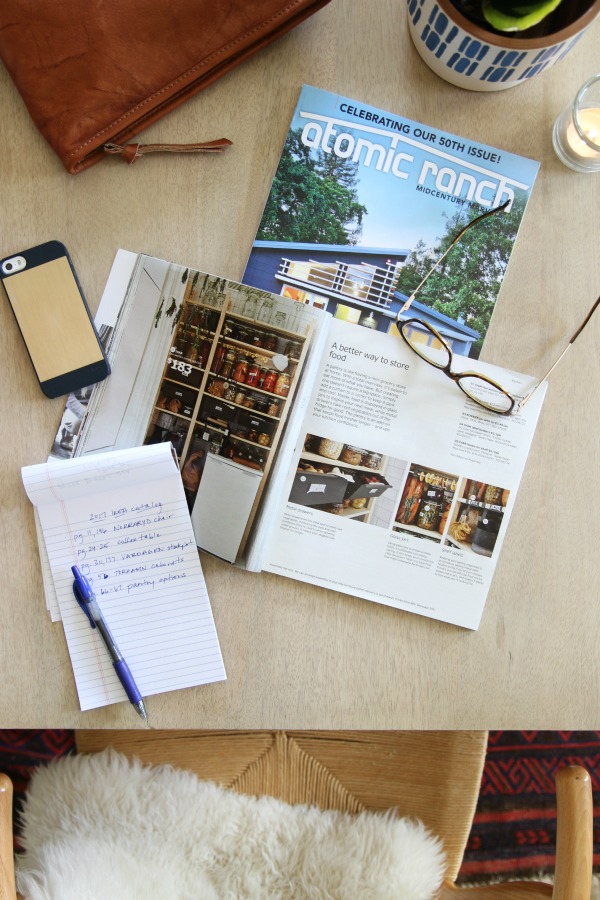
The 2017 IKEA catalog is out! Have you had a chance to pore over it yet? Each year I share my takeaways and this year is no different. I received my copy last week and finally had a chance to look it over. I made a list of the items and ideas that caught my eye. I thought I would share them with you today. In an effort to avoid ruining the novelty for others, I won’t be sharing photos of each item. I’d love for you to experience the catalog on your own then refer to my list if you feel inclined. If you don’t have a catalog in your hands, you can view it online here. (I’ve linked to most items within the post, but this narrative is really meant to accompany the catalog as some items and ideas aren’t listed online.) Let’s get started!
pg. 10, 11, 196 The NORRARYD dining chair is a modern take on the traditional Windsor chair. I love the scale. (The back isn’t too high.) It comes in three versatile colors: black, white and red.
pg. 24, 25 I love the DIY coffee table idea! The open storage and lower profile make it ideal for smaller and/or open concept spaces. You could stash books, games and toys in the base. I’d love it even more if the crates were reclaimed or vintage. I would get creative with the top. What about butcher block, painted plywood, remnant marble or feather-finish laminate?
pg. 30, 177 You can’t go wrong with a big, inexpensive stockpot like the VARDAGEN.
pg. 56-57 I need to see them in person, but I feel like the TORHAMN cabinet fronts could work well in the right context. (In a modern farmhouse with lots of white? I don’t particularly like how they’re styled in the catalog.) The wood grain might get a little busy, so I’d be inclined to use white open shelving in lieu of upper cabinets. There are a few more new cabinet front styles listed online, but I still think IKEA is missing a huge opportunity by not offering unfinished, paintable options and timeless, classic designs like true shaker fronts.
pg. 66-67, 184 All the heart eyes for an organized pantry, especially the steel IVAR drawers and mini fridge.
pg. 82-83, 252 The transitional style of the MALSJÖ cabinet is so handsome. The recessed brass pulls are my favorite detail making this piece one of my top picks for 2017. I’d use it as a mini home library to corral books and albums or in a dining space to hold serveware, barware and alcohol.
pg. 88, 229 When I designed a nursery for my eldest (twelve years ago!) I used a PÖANG chair instead of a rocker and it worked great. I love the leather upholstery option.
pg. 108-109, 272 I’m all over those shapely FLÅDIS baskets.
pg. 116, 302 The FLISAT children’s series features practical storage in natural wood tones. Mabrey has the wall storage (not shown in the catalog, see it online) in her room.
pg. 124-125, 238 I spy flatwoven rugs made with jute, wool and sisal. They’re great for adding natural texture to any space. Priced affordably, they’re sure to be bestsellers.
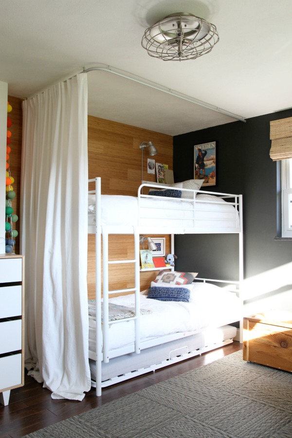
pg. 129 Many of you have asked about the curved ceiling track I used for the boys’ bunk bed enclosure. It was discontinued but it looks like IKEA has improved the design. The new VIDGA series hugs closer to the ceiling and is white to blend in with most ceilings. (The older version sat a few inches off the ceiling and was silver.) A corner track is available to create enclosures and room dividers.
pg. 173 It isn’t new, but the BITTERGURKA plant pot is too cute not to mention. The small scale makes it perfect for growing herbs in the kitchen during cooler months.
pg. 190 I’ve always loved the classic and inexpensive kitchen linens at IKEA. The new VARDAGEN napkins and tablecloth are wonderful additions to the line. I’d use them for everything from everyday family meals to summer picnics to Thanksgiving dinner. So versatile!
pg. 207, 255, 273 I’m drawn to the muted colors and metal detailing of the FJÄLLA boxes. I like them paired with the fabric-covered KVARNVIK boxes for contrast.
pg. 221 The NOCKEBY sectional is good-looking and I like the practicality of a washable cover, but I need to give it a sit in person to determine how comfortable it is. The light beige and light gray upholstery options look promising.
pg. 248 The STILLHET tealight holders are so pretty.
pg. 319 The SLADDA bike is perfect for urban life and sleepy coastal towns. I love all the adorable accessories!
That’s my list. Truthfully, this year’s catalog isn’t my favorite. The staged rooms read a little too catalog, and some of the new things I’m normally excited to see (i.e., large furniture pieces, bedding, pillow covers, lighting, cabinet fronts, etc.) just weren’t there for me. (Although, I’m curious to see the EKBACKEN concrete lookalike laminate countertop in person.) Fortunately, many of my favorites are still available: STOCKHOLM sofa, MÖRBYLÅNGA dining table, the HEKTAR and SINNERLIG pendants, LAXARBY fronts…to name a few. I did appreciate the personal and behind-the-scenes stories woven throughout the catalog. I think it would be great if IKEA could somehow give the catalog more of a lived-in, lifestyle vibe. Maybe shoot even more in actual homes? I get the best ideas when IKEA products are mixed with vintage or bespoke items and shot within a real life scene. I enjoy catalogs that promote ideas alongside items. Just my two cents :)
I’d love to hear your thoughts on the newest IKEA catalog. Any favorite pieces?
images: Dana Miller for House*Tweaking


budget decor, DIY, IKEA kitchens, inspiration, interior design