By far, the questions I get asked most frequently have to do with the paint colors in my home. I wrote up a post devoted entirely to which paint colors are where here. However, we painted our walls over 3 years ago and it seems the Bonsai/Magic Spell Valspar swatch and the Wet Dock Valspar swatch are hard to come by nowadays at Lowe’s. Even so, my local Lowe’s still carries them. Southwestern Ohio must be last on the list for a paint department upheaval! Anyway, for the last few weeks, I’ve been picking up loads of paint swatches from all my local paint supply stores in search of Bonsai/Magic Spell/Wet Dock lookalikes. {I wasn’t able to get my hands on any Benjamin Moore swatches as the nearest BM supplier isn’t within my regular driving area.} I found some pretty convincing ‘fakes’ that I’d like to share with you today. Hopefully, they are in stock at your local stores! {FYI – Due to the nature of this post, all images are original and unedited taken under natural light. I always recommend grabbing swatches and taping them up on your walls at home with painter’s tape before committing to a color.}

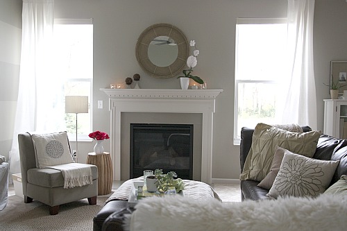
- BONSAI {Valspar/Lowe’s} – This color covers the majority of our walls including our kitchen, sunroom, dining area and family room. It’s a light, airy gray that changes throughout the day depending on the lighting, going from light gray when drenched in sunlight to a green-gray in indirect natural light to a warm, taupey gray under artificial light. I found three Bonsai lookalikes available at Lowe’s and Sherwin-Williams that would make it hard to tell them apart from The Real Slim Shady. {I didn’t have much luck matching up Bonsai at Home Depot.}

Some great Bonsai alternatives:

1. Frappé – a Valspar color available at Lowe’s.

2. Jogging Path – a Sherwin-Williams color.

3. Linen – a Valspar color part of the Signature Colors/Eddie Bauer Home Lakeside Cottage collection available at Lowe’s.

- MAGIC SPELL {Valspar/Lowe’s} – This color is on the same paint swatch as Bonsai and is one shade darker than Bonsai. Magic Spell lends a warmer, taupier feel. It’s in our first floor powder room and looks amazing with white accents. I was able to match up four Magic Spell-esque colors available from Lowe’s, Home Depot, Walmart and Sherwin-Williams.

Some great Magic Spell alternatives…

1. Gray Silt – a Valspar color available at Lowe’s.

2. Olivewood – a Glidden color available at Walmart and Home Depot. I noted the swatch number for each store above…be careful, they’re different!

3. Ethereal Mood – a Sherwin-Williams color.

4. Porch Gray – a Glidden color that’s part of the Better Homes and Gardens Editors’ Choice Paint Colors available at Walmart. I didn’t see it at Home Depot even though Home Depot carries the Glidden line.

- WET DOCK {Valspar/Lowe’s} – This color is still in the gray family but has a creamier tone to it than Bonsai. I used it to paint two, wide horizontal stripes on our TV wall in the family room for subtle contrast with alternating Bonsai stripes. I was able to find two Wet Dock stand-ins at Lowe’s and Walmart.

A few great Wet Dock alternatives…

1. Bay Sands – a Valspar color available at Lowe’s.

2. Geneva Swan Gray – a WM119 paint swatch color available at Walmart.
And that’s the extent of my paint swatch hunt. I really think any of the colors mentioned above could be used pretty worry-free for a nice, neutral backdrop. They are good Bonsai/Magic Spell/Wet Dock alternatives if you happen to live in one of those cities that’s already had their Lowe’s paint department revamped. If anything, maybe they will save you some legwork. Like I said, my local Lowe’s still has the original Bonsai swatch in stock. In fact, I happened to grab ~20 of the Bonsai/Magic Spell swatches on my hue hunt so if you want the real deal shoot me an email and I’ll be happy to send you one as long as you provide a self-addressed, stamped envelope. First come, first serve! Which brings me to another paint point…just because you grab a swatch from a certain store doesn’t mean you have to have it mixed up there. Feel free to take your desired color swatch to the paint department of your choice and have it color-matched.
What a gray post, right? It definitely wasn’t anything pretty to look at but hopefully it was practical and useful. I’m crossing my fingers that these alternatives are available at your local stores. Happy painting!
PS – If you have an idea for a blog post you’d like to see on House*Tweaking, please feel free to send me an email at danarmiller {at} hotmail {dot} com. I find that many of my readers have similar questions, styles and interests so it’s sometimes helpful to address certain topics in the form of a post…for instance, suggestions for alternative Bonsai paint colors.
images: Dana Miller for House*Tweaking
Hi Dana,
Paint color is my biggest home DIY nemesis. I’m inspired by your choices. I’ve noticed that the colors you used in your previous house were gray with green hues. Was there a design reason for having a green base in the paint colors? Even the dark accent wall that was in your master had green undertones.
I’ve also noticed that your new house doesn’t have the infamous green-based hues. It seems you’ve chosen warmer hues with subtle, lighter creams. I’m just curious, why? Is it the latest trend? What’s your strategy? – Angelina
Well, Angelina, I have to say that choosing paint colors for our previous house was a quicker and easier process. It was a large home with tons of tall windows, plenty of natural light and high ceilings. Those attributes alone set the stage for nearly any paint color to work well. I chose Valspar {Lowe’s} bonsai for 95% of the house. Three walls in the formal living room were Valspar {Lowe’s} dry riverbed which is a muddy gray. The mini mudroom and laundry room were a soft blue-green. I had a dark accent wall behind my bed. My craft closet was a light lavender-pink. Quite the mix!
Looking back, other than most of the walls being a gray-green, I had no real strategy in regards to paint. And it totally showed. I chose colors that I liked without paying much attention to how they worked as a whole. It wasn’t as noticeable in the house because the different colors were somewhat far apart from one another but if I had laid out all those color swatches next to each other, I think I would have realized it was a strange color palette.
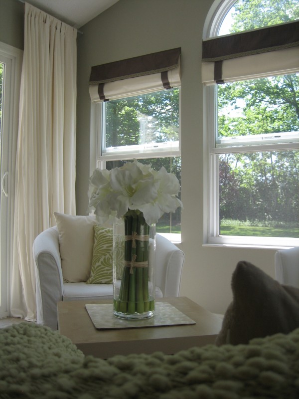
I was intimidated to repaint anything on a large scale. {That’s why the few other colors in the paint palette were painted in small rooms or only as accent walls.} The rooms were huge and pretty much all open to each other and there was a two-story foyer. We paid a professional to paint the entire house the gray-green color before we moved in. I wouldn’t have wanted to redo the work we had already paid for and, for the most part, I really liked the gray-green. I chose it because the house’s numerous windows had views to the outdoors which was mostly green trees and grass. The green undertones worked really well.

Our current house is very different from our previous house. It’s older, smaller, squattier {technical term}. There aren’t as many windows and the ones we do have are smaller than what was in our previous house. We also have a deep overhang blocking some direct sunlight. And the house feels different to me too. From day one, it’s felt very masculine.

Many of the paint colors I originally chose for this house aren’t jiving with the masculine feel I get from it. It’s taken me several months to realize that. Also, paint colors look totally different in this house than in a house that is blessed with natural light aplenty. Thankfully, paint is an easy fix here because the rooms are smaller. So far, I’ve repainted Mabrey’s room, the boys’ shared bedroom and the mudroom {several times!}. I’ll be repainting the master bedroom and bathroom soon. Gradually, I’m building a paint palette that feels masculine and cozy just like the house itself.
What I’m getting at is my previous and current homes have different palettes because they are two completely different houses. It’s not my intention to follow any trends – although I’m seeing moody colors everywhere right now! I’m trying to choose colors I’m drawn to that also happen to work well in this house. I’m more conscious of the overall palette too. It’s been complete trial and error but a great color palette is evolving. Take a look…

Laying out all the colors together like this helps me to see the bigger picture and to see how the colors in different rooms relate to one another. I even went as far as to lay them out in the order that I normally see them upon entering the house. Nerd. {By the way, I stole the paint-dipped clothespin idea from Emma. She’s a genius.} Whites, grays, blacks and deep blues are giving my house a very cozy masculine look. I’m loving the way they all look together too.

Here, I’ve labeled them for you. As you can see, there are a range of light and dark colors. In rooms where the walls are dark, I use a lot of white to lighten them up. In rooms where the walls are light, I use dark items to ground them. I love contrast. FYI – The gravel gray will be going on the outside of the clawfoot tub in the kid/guest bath.
The palette isn’t complete. I’ll be painting our bedroom Benjamin Moore’s anchor gray but I don’t have it on hand. Maybe a paint palette update is in order when I do get it?
I hope that gives you a better insight into why you see a different color palette evolving in my current house. In my opinion, choosing a paint color palette for a home is just like anything else house-related. It takes time and a little trial and error. What looks good in someone else’s house may not be the best choice for yours. For example, I adore all white California rooms but, come to find out, they don’t work well in my midwestern house. Try looking to your wardrobe for inspiration. My current palette is very indicative of my wardrobe. Mostly neutral basics with pops of color and pattern in accessories. Thanks for the question Angelina!
What about you? How do choose color palettes for your house? What palettes are you drawn to? Do you have a great method {like Emma’s paint-dipped clothespins} for seeing the bigger picture?
images: Dana Miller for House*Tweaking


budget decor, DIY, inspiration